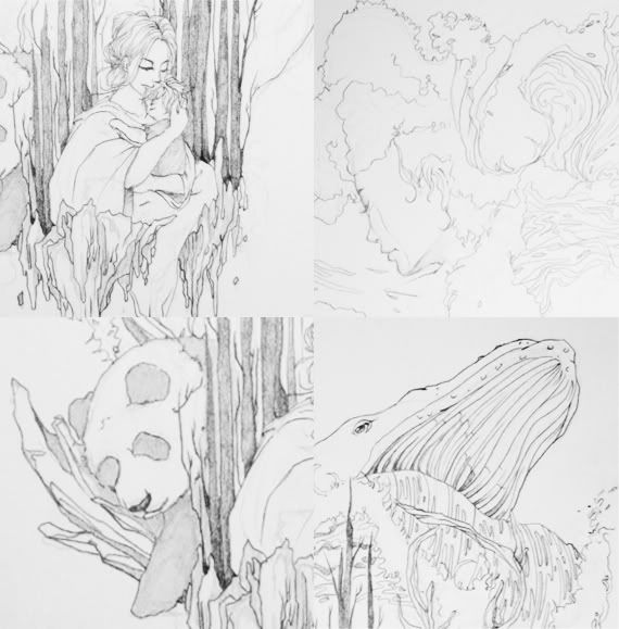
When I was brainstorming for ideas, I found myself keep coming back to this one: about the last piece of earth containing all the things we will want to protect and keep safe, mother earth in the background, turning her disappointed face away. So I began with some sketches. Since the poster is A1, I needed to work on a bigger piece of paper to get all the details in. I ended up with three A3s, joined together to form my composition.
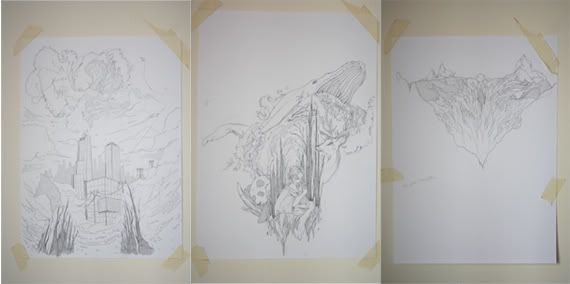


After taking pictures of all these (my scanner only scans A4), I crop and resize them properly in Photoshop. The end product will be my final composition.

Next was deciding the colour palette. I came across this album design as well as the "Never Let Me Go" poster with a palette that I really like. These palettes are quiet and whimsical, bringing out the sombre and melancholy feeling that I seek. Using these images as references, I reproduced the colour palettes and use them to colour the foundation of my illustration.


In the end, I decided to take out the bottom part. There were simply too many things and the last part simply detract attention away from the center. By taking out the bottom, I've given myself ample space to place my headline as well.
I was really satisfied with this piece. However, the lecturer didn't really see this my way. She thought it looked flat and the colours not exciting enough. I didn't agree with her critique because it was not my intention to do something too "in your face".

But alas, I gave in to the fact that she's like a client I have to please. To give something neutral like the above a more exciting note was easy, just add a few textures and a more dynamic gradient in the background. Worked like a charm.
I did stumble upon a few nice effects when I was tinkering with the blending mode. Check them out. I like. But not suitable.


This is the final design which I will be printing on A1. I find myself surprisingly liking this better than the neutral looking poster. Another lesson in not limiting myself to my own thoughts and assumptions. There is always a way in improving upon something.

This is the first project that I've uploaded into Behance. I've decided to upload more works there so that it'll serve as my online portfolio. I want so much to have a website where I can put everything under one banner but for the lack of time, Behance is really my best choice.
More posts will come, a chronology of my preparation for graduate exhibition. Like my work? Help spread the word.
=)
6 comments:
nice one. :)
thank you~
Your presentation was like an art feast, yum yum~
I really do like your original piece better. I liked the empty spaces around the main design.
The edited piece is more dramatic but I like the first one better.
Evelyn here BTW
Gorgeous!
i super like ur poster!!! really nice!
Post a Comment