It felt like ages since I last blog something on my assignments.
This is the first thing we did for Graphic Design this sem. It's actually a Lamborghini skin design competition disguised as class work. Initially, student participation fee is RM150. But since they seemed to really want us to submit something for this, selected artworks for participation will be sponsored by the uni.
So yeah, everyone in class will submit one piece of artwork. Then from this, a certain number will be filtered through. The grand prize is pretty amazing where relevant: RM5k, ride on in the Lamborghini around Sepang circuit (yada-yada), artwork will be printed on the real car and be put on display in selected malls, plus, an internship position in a renown advertising agency. It sounded so good. But then again, LUCT rarely deliver on their promises, so let's just take this at face value as of now.
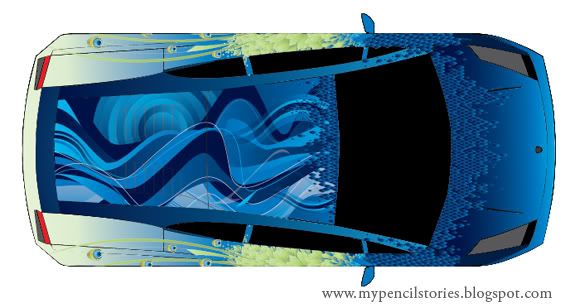
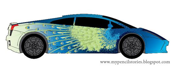
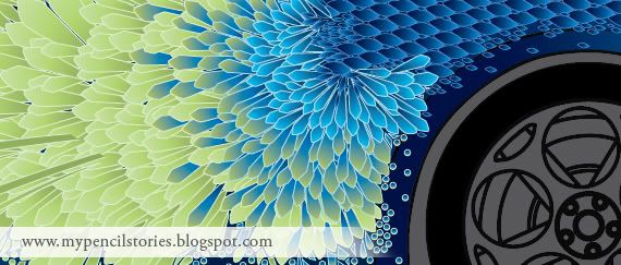
My concept is inspired by the intricate patterns on a peacock as well as the luxurious colours of its feathers. Can you spot the bird?
My take on this from the personal I-slaved-over-this-too-much-to-not-like-it point of view.
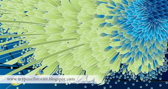
I love it. I seriously love my designs on this car. I started off not knowing what to do. The idea of a peacock simply struck me and I wouldn't even consider some other concept. I just went through with this. I did some half-hearted sketches, knowing all the while the work is in me and I'm dying to quickly do something on-screen. I love the colours. The patterns. When I finished with the side of the car, I simply can't take my eyes off it. To me, the colours are brilliant and really striking. That part of the design pops out from the flat surface. I like how everything looks so shiny and the scaly patterns look like crystals from the sea.
Looking at my work as if it's designed by my worst enemy.
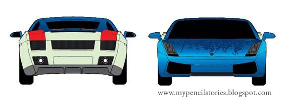
I don't like the look from the back. The light green at the back looked so faded and dull. Plus, the composition of the round patterns supposedly an imitation of the peacock's tail fell flat. I placed them very uninspiredly anywhere I can find a place to chuck. The swirly patterns at the top of the car can be more intricate. Some of the patterns look flat as they don't really follow the contour of the car.
In conclusion, I am very happy with my design this time around. I really really am. Screw that part of me that thinks there's something wrong with it. There is, obviously. But right now, I'm just happy with the outcome. I can stare at the side of the car for the longest time. It's so pretty. Lalalalalala~
On a much more serious note, do you see anywhere else I can improve? Umm? Throw me your two cents! Thankyouverymuch.
ps: yes yes yes.. self-praise is no praise. whatever. =)
4 comments:
Your sides are mesmerizing (the car sides, not your body ... though they could be, for money) but the back is goddarn boring. The feather tails should extend to the back and give a wonderful teasing 'eye' as a final send off. Extend more stalks of the tails across the back panel. it needs to finish bold! Right now it's like premature ejaculation! Nothing to show for it at the end.
i like the layering of feathers, very intricate. the roof of the car seems to break away from ur peacock concept, the swirls dun seem to jive so well. the back of the car is a little dull. maybe u can extend the tail a little bit more.
a Lamborghini is a very showy car, masculine and power. the idea of using the peacock fits the showiness of the car (its character). perhaps a touch of stronger colours could help bring the masculinity out as well.
nice job :) *pat pat*
@mike: did you just compared my design to premature ejaculation?? umm. sorry, i can't get my mind past that fact.
@oli: thanks for the comment. it all can be better. i guess i was too preoccupied with how nice the side looked, i thought it's enough to support the whole design. this has always been one of my weakness that till now, i did not quite successfully overcome.
wanna know how i rationalise the dull back in my submission? imagine it as a peacock with its tail close. nothing impressive, quite humble, similar to the dull back. but when you shift your eyes to the sides and the top, it's like the peacock spreading its tail in all its glory.
am i stretching it, or do i actually make some sense? hah.
yes, mike was making that comparison, he said. BWAHAHAHAHAHAHA(farnee)! :P
mmm, i think the back rationale is not strong enuf, not oomph enuf. as for the top, there's a disconnect there. how about trying to stretch the feathers all the way to the top as well? imagine looking down at the peacock tail from aerial view.
Post a Comment