There was this CD album that we had to do in class. It was a sudden thing and we had only one week to complete the project. I think I finished mine in one night. I only thought of the concept, did the sketches and executed them all in a single night. It was only ten percent, an additional 10% to boot. No excuse for procrastination, but still! Anyhow, like before, I thoroughly enjoyed working well into the night. I love working at night, during the day I either felt like eating or sleeping.
Anyways, the title for the album that I've chosen out of the three choices given was Breakthrough. My concept's 'dawn'. A breakthrough into a brand new day with fresh hopes, fresh inspirations, yada yada.
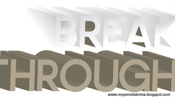 First round in Illustrator. I have a thing for 3D beveled type. I like messing around with the different gradient that can be applied on all the surfaces and how every time it'll look really attractive and will simply pop out of the page.
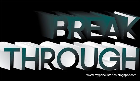 Went through the whole process again when I've decided to change the colour from light transparent to dark shadowy green.
 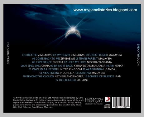 This is the back of the album. It looks pretty good to me. I thought I could jive it with the album cover I did at first, but after much thinking and messing around, I knew I couldn't do it.
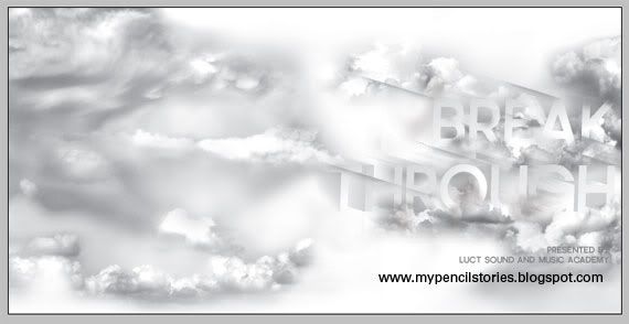
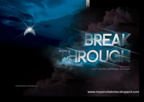 So, after some thorough amendments, the cover for my album looked like the above, the stuff on the right. For the first try, I created the clouds using pictures I had by blending and masking them into each other. But when I did it for the second time, I found it a whole lot easier to just use some cloud brushes. There's better control over size and colours.
 This is supposed to be a poster I printed on the back of my booklet, which is an A3 poster/booklet thing that can be folded to fit into a jewel case.
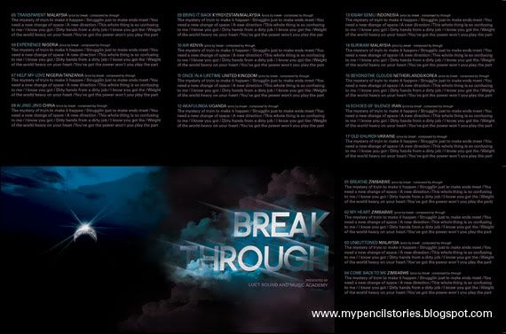 I fit all the lyrics into one side of an A3! It felt like some really cheap-skate accomplishment. But but but... I've only spent RM13 on the printing for this whole album design. Very much worth it to pluck that 10% from the lect's fingers.
 ps: this is supposed to be pnc. hah. you didn't hear this from me. tralalalalala~
3 comments:
the greyscale cloud with title also not bad indeed. =]
=) thanks! but hard to match with the dark back.
I like your colour scheme. Putting colours into the grayscale clouds design showed more detail.
If I've got a "favourite ckq design" folder. This would be in it.
Post a Comment