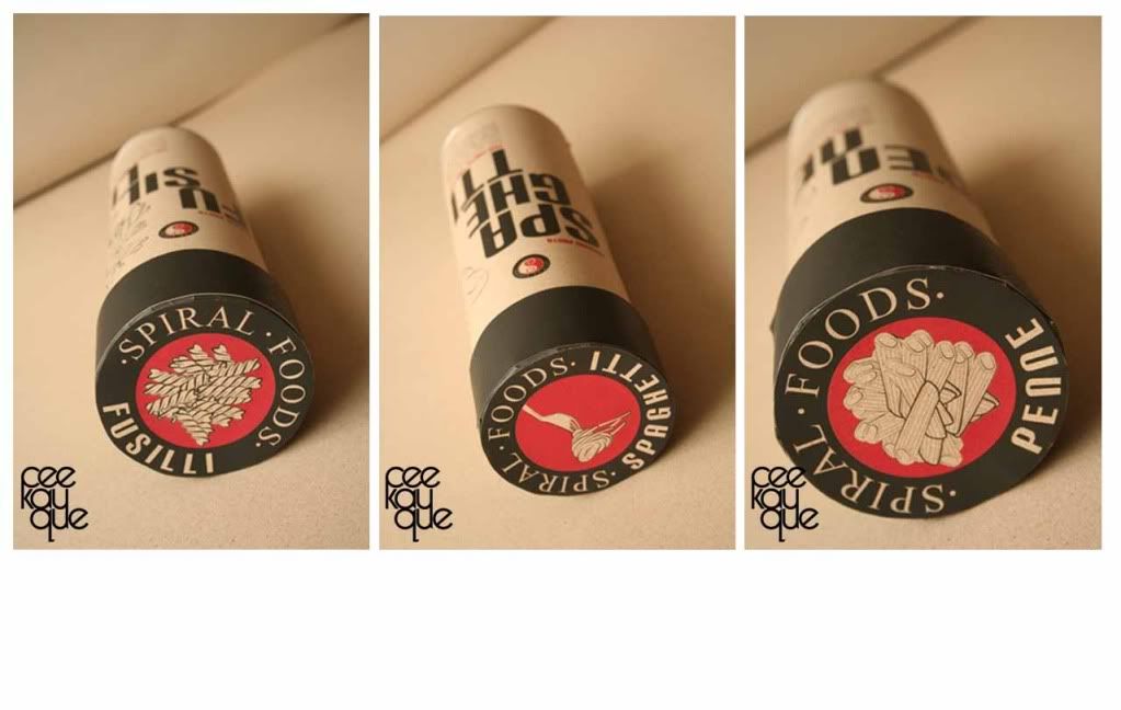
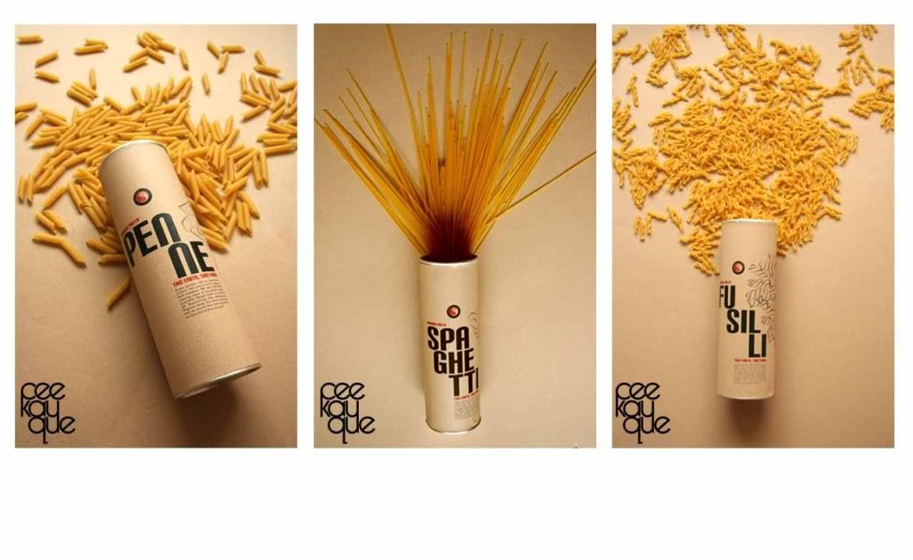
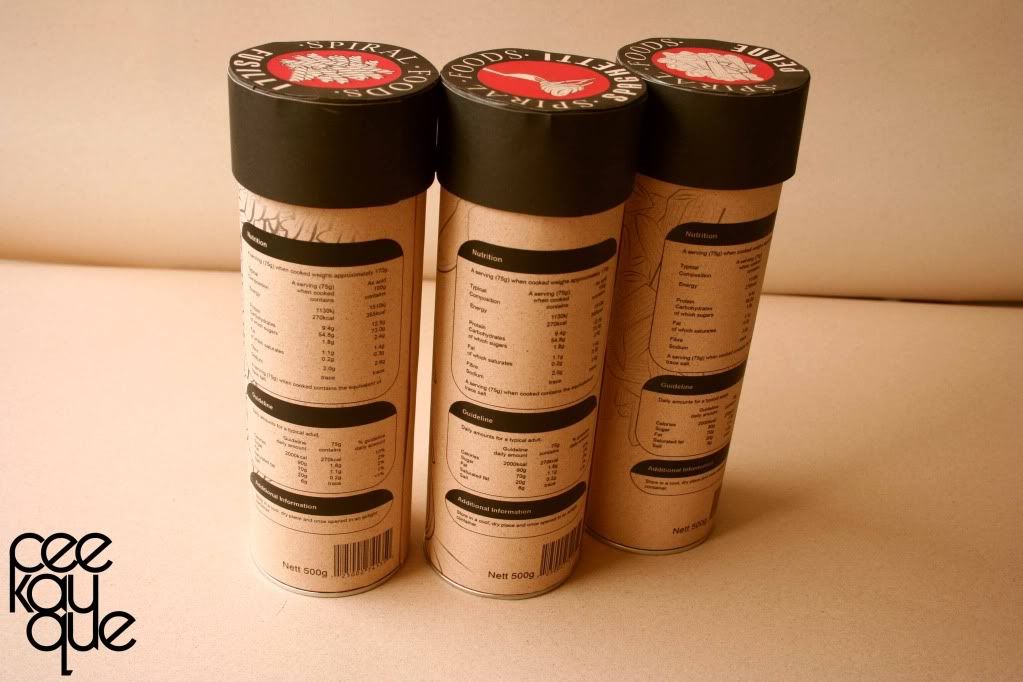
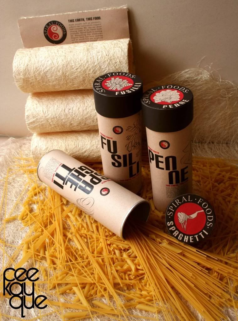
AH!!! I had such trouble trying to upload these pictures! I don't know what's wrong with my image uploader in blogger.. not even sure if it'll fix itself in time. Anyway, once again, I used Photobucket to upload these. Otherwise, who knows when it'll be until I'll be able to share with you my latest fantastic work? Wahahahha~
Right. Another packaging design. This cost so little this time around, just a little under a hundred ringgit. Yea~ extra money for good food.
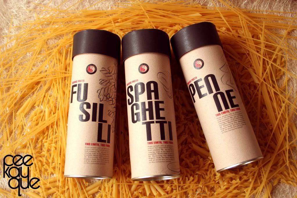
And I happen to think this is my best effort when it comes to shooting my own product design out of the studio. It doesn't look cheap or anything like that right? RIGHT??!
Pasta packaging. Modern minimalism. Natural Packaging. Red. Black. Corporate colours. Like, what else can I say?
So, you dig? Heee....~
ps: Please enlighten me.. click on for larger view. =D
7 comments:
Cool design.
It's been a since my last pasta......
hungry...... T-T
oo! i have the remaining pasta from the project.. i go buy pasta sauce, then we cook for everyone, ok? or rather, u cook la.. i buy. heh~
wow......AWESOME!!!is really cool...
sophisticated n ...really COOL!!!!lol..
heee... *blush blush* thank you.
Lol! Nice! Free meal! ---w---.
i digg~
loving the colour, the concept of using a cylinder, the wordings, the fonts.
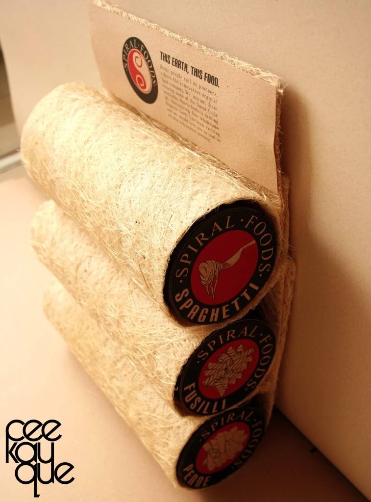
i dont really get the cocoon like thingy though. so, these cylinders of pasta would be put into the cocoon thingy?
very vintage-y, vert pasta-y, very western-y, i loike~ =)
wahahhahaha~ cocoon thingy... yep, like an additional storage space lo..
oh well, i just did it for extra marks, i guess. hahahhaha~
Post a Comment